Worth the Paint: Kitchen Cabinets
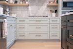
When deciding on our kitchen cabinet paint color, it came down to 2 options: SW Comfort Gray and SW Sea Salt. I knew I wanted a pop of color, but one that also felt serene. We were inspired by some coastal and some lakeside styles, so we decided a blue-green would do the trick. Hence, these 2 colors.

After testing the colors at different angles, and at different times of day, I decided Sea Salt was my favorite. Although these 2 colors are only one shade apart, Comfort Gray leans more blue, while Sea Salt leans more green. Comfort Gray felt darker, while Sea Salt was just the right amount of mint we were looking for. Had it been any more green, it might look like it’s meant to be at the register of a candy shop. But any more blue looked more muted and more farmhouse than what we wanted for our home.
Since our kitchen brings in north lighting, anything in that space is going to appear more blue. Keep this in mind if you also have north-facing windows. Comfort Gray could be put in a south, east or west-facing room and appear more like a warm green. Do that with Sea Salt, and it might look too minty. That’s why Sea Salt in our north-facing space was the perfect pop of color we wanted. The blue tones calmed down the green perfectly. And thankfully, the color is transitional as the trends change!
It’s always good to sample paint colors in your space before deciding. Take into account what direction the room faces, how big the windows are, what natural and artificial light is involved, etc. And overall, go with the color that you love the most!